Meta-Narrative and Hypercriticism
Artistic Autonomy in Nabokov, Clowes and Pamuk
by James Romberger
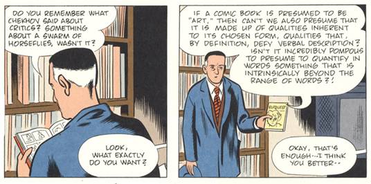
Figure 1: Detective Ames criticizes comics critic Harry Naybors, from Daniel Clowes’ “Ice Haven”
The greatest literary works of the last century take the form of metafiction. Authors such as Vladimir Nabokov and Orhan Pamuk upend the concept of the novel with self-referential and ex-referential layerings. Metafictional techniques are now being brought into other mediums such as graphic novels that re-envision not only literary sources, but those of art history and pop culture as well, exemplified in the meta-narrative comics of Daniel Clowes.
“Pale Fire” is a work of fiction that takes on the guise of a heavily annotated book of poetry. Vladimir Nabokov created an astounding character with his obsessive compulsive editor, Charles Kinbote. Ostensibly compiling a posthumous edition of his neighbor John Shade’s last work, Kinbote overpowers Shade’s epic poem entirely with rampant misreading and a plethora of information about his own questionable exploits as the supposed expatriate “King of Zembla.” The egotism and arrogance on display in Kinbote’s introduction and copious annotations make them seem that they could be the work of the self-indulgent, sybaritic King described in those notes. Kinbote brings the world of his beloved Zembla to life, but the story he imposes over Shade’s poem exposes his nature. By his own admission his Queen in Zembla withered as he used the power of his position to indulge his pederastic wont.[1] Kinbote behaves with ever increasing psychopathology to a series of maneuvers that lead to Shade taking a fatal bullet intended for the King who thus gains control over his finished manuscript. Having watched Kinbote stalk Shade, the reader knows not to trust what he writes. One is left wondering if Kinbote murdered Shade himself, or if Shade even existed, or if Shade was the author and Kinbote the invention, or various and sundry other possibilities. The index reveals further absurdities and speculations.
The doors opened by Nabokov have invited others to explore uncharted meta-narrative areas. Daniel Clowes is a major figure in the emerging form of graphic novels, creating increasingly complex storytelling art, who has acknowledged Nabokov as an influence. The undependable critic is a recurring motif in his work. In Clowes’ 2000 graphic novel “David Boring,” the title character has only one relic of his dead father, who he never met: a copy of an obscure comic book he drew. The comic is a source of pain to his mother, who rips it up when she finds it among her son’s possessions. Boring tries to analyze the few torn panels he saves, to divine some sense of “Dad.” Like the poem in Pale Fire, the comic is a narrative within a narrative, its panels printed in color, interspersed among the black and white pages that make up the greater part of the story. The color art references the look of the most banal American comics from the sixties, badly written juvenile product drawn, inked, lettered and colored by studio piece-laborers. Clowes discussed Nabokov in the context of David Boring:
"I was certainly inspired by Pale Fire, I think, with his undependable narrator….The way he sort of references this text, that being the old comic book, and sort of re-imagines it into what he wants it to be. When I was reading Pale Fire, I remember the thing I really responded to was the idea that I had, as a kid, read comics that my brother had left lying around, and I had tried to take from them some unconscious message that wasn’t necessarily there." [2]
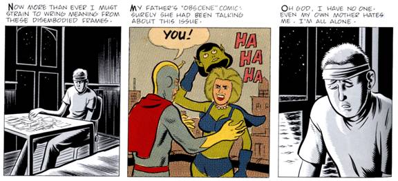
Figure 2: Which comic is real? Daniel Clowes, from David Boring.
Boring’s misreading is innocent, though, nothing like the malignant egotism of Kinbote. Boring is just trying to construct a past, a history for himself. Oddly, given the spare nature of Clowes’ art, it is hard to not ascribe a roughly equivalent “reality” value to the panels in color and the ones in monochrome.
Clowes’ more recent graphic novella “Ice Haven” manifests yet another extension of Nabokov’s ideas. Clowes’ version of Kinbote splits into two characters here: the comics critic Harry Naybors and the maybe-serial killer Random Wilder. Wilder is a petty, pompous poet/pedophile that imagines himself to be the great bard of the little town of Ice Haven. The whole county is searching for the young, mute child he has abducted and is keeping in his basement. Detective Ames, who with his wife and partner is investigating the child’s disappearance, mockingly analyzes Wilder’s poetic kidnapper-note on national television. His young female neighbor respects the poet image Wilder projects, and gives him a copy of her zine. After reading her “beautiful beyond desciption” poetry, he realizes that his writing is terrible. He makes a failed suicide attempt, then comes to his senses and releases the child. Clowes then hammers the happy ending home to the reader by having the whole town join hands and sing about the child’s safe return. The last page of the book shows the supposedly mute child home safe in bed, alone, reciting Wilder’s bad poem which he has committed to memory.
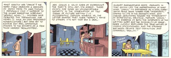
Figure 3: Naybors defines the comics medium, panels done for the hardcover edition of Daniel Clowes’ “Ice Haven.”
Clowes’ comic-book critic Harry Naybors bookends Ice Haven with his opinionated and self-referential “appreciations” of Clowes’ career. Naybors acknowledges his own fictionality (he is writing a paper about the “origin of his name in an obscure 1960s Super Duck comic”) and asks if the reader thinks Clowes likes him, [3] then poses a question that seems to be what is at issue in Pale Fire as well: “Is criticism ever really about its ostensible subject, or is it primarily an expression of self-definition?”
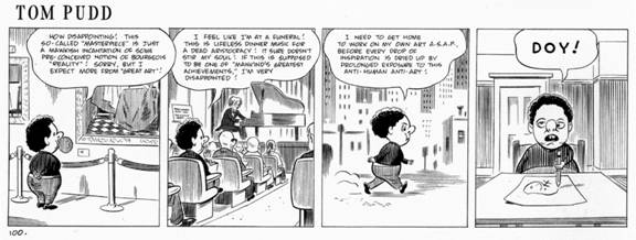
Figure 4: Clowes skewers backseat artists, from “20th Century Eightball”
The reader is given to accept that Pale Fire only reached print in the form we are reading it, so Kinbote won. He successfully imposed his editorial hand and his life’s story on the artist John Shade’s work, nearly obscuring his stated reason for bringing it to print. He pressed his tale on Shade in the hopes he would inspire a great poem, then is disappointed when he cannot recognize himself. He misses where he is and projects himself where he is not. He is the critic as perhaps-murderous stalker, who claims to hold Shade in high regard yet eclipses him with egocentric verbal prolixity, a blabbermouth Solieri of letters.
However, Kinbote’s story has dramatic qualities that transcend Shade’s personal poetic odyssey. The journey of the outcast King has many of the elements of great adventure. Shade’s poem would not stand so well on its own, its “original intent” is confounded by the apparently irrelevant and conflicting story information, and the poem is further confounded by the reader’s eventual, necessary reanalysis of it in light of Kinbote’s erroneous conclusions, and his blindness to the connections to his story that actually are visible in the poem.
In his 1997 pamphlet, “Modern Cartoonist,” Clowes assumed the stance of an unreliable critic/theorist of comics. He elaborated an auteur approach and decried the traditional group-effort system of American comics, quoting Nabokov: “‘There is nothing I loathe more than group activity, that communal bath where the hairy and slippery mix in a multiplication of mediocrity.’” In his polemic (spot-illustrated with practical information about using an Ames Lettering guide, and an image of the artist slitting his wrists), Clowes railed about interactivity:
"The new technology promises…the reader …an exaggerated role in the give-and-take between artist and audience. He is to…‘interact’ with the narrative. Is this a good thing? Is our every reader a worthy collaborator or does his involvement dilute the whole process? This is where the ‘entertainment media’ is headed: to pander to the impatient lout and to provide him with material that ranges only from masturbation fodder to the narrative equivalent of a roller-coaster ride."
He praised comics as “the ultimate domain of the artist who seeks to wield absolute control over his imagery,” yet also paradoxically proclaimed, “even (especially) in their most debased form, comics have an aura of unspoken truth.” Clowes said later, “I tried to write something that had this certain tone I find amusing …on the razor’s edge between this sort of pompous heartfelt earnestness, and its ironic counterpoint.”
Comics like Clowes’ transcend illustration because the textual and graphic elements are rigorously conceived as integral to each other. Still, Clowes, like each of the individual stylists in comics, comes from a distinct lineage of drawing. I detected aspects of comics master Bernard Krigstein in his earliest work when it came out. His other traceable influences include early master of strip simplicity Roy Crane, “Mad Magazine” genius Harvey Kurtzman, and narrative structuralist Art Spiegelman.[4] Ice Haven ups his ante artistically by referencing a variety of stylistic tics from comics/ cartoon history, i.e. sequences of kids talking designed like Peanuts strips and a strip done in the banal style of 1950s Dell Comics. The styles of Dondi, Mary Worth and other strips are there, if sometimes only in the design of the chapter logos. Clowes’ tight control of the subtle affordances of cartoon drawing provides enough continuity to allow these disparate sequences to blend into an effective whole.
This generational assimilation is much like the visual lineage of the artists in Orhan Pamuk’s evocation of the 16th Century workshops of the Turkish Miniaturists in “My Name is Red.” Pamuk’s illuminators always refer to great artists of antiquity who defined how such and such must be done perfectly. The varying comic-strip styles of Clowes’ narrators appear to pay homage to past icons of cartooning. As well, Clowes’ tactic of using disparate comic styles to differentiate between his narrative threads in Ice Haven resembles Pamuk’s daisy-chaining of his narrators, who each pass along the storytelling baton to the next voice. The characters relate to each other in similar cross-overs into each other’s sequences, which provides the glue of the narrative.
The Enishte functions in the workshop as an editor, compiling portfolios of illustrations by teams of artists to be bound into books, on the order of a client or by royal decree. The artists each have delegated duties, one is good with figures, another horses, another gilded borders, and so on. The artists of the Enishte’s shop are imbedded in their style. Their work becomes a collection of reorganized templates. This is similar to the distribution of responsibilities in the early workshop studios of American commercial comics, where an editor oversaw a group of artists working according to expertise in figures, backgrounds, inking, lettering and logos, etc. Styles of design and rendering were proscribed by printing technology. The black line drawings seen in cartoons are “holding lines” for the color registration, made thicker or heavier to allow for color alignment. Cartooning tropes that were developed for the four-color printing process resemble the template imagery and representational limitations imposed on the miniaturists.
In the Turkish illuminations the linear quality satisfies the religiously ordained requirement of flatness, a two-dimensionality imposed so art would not presume to God’s view, that seen by them as sacrilegious in the full-perspective and chiaroscuro realism of the Europeans. When assigned to do sacrilegious drawings for the Sultan’s special folio, Pamuk’s miniaturists all assume that they could master the European techniques, but this is not borne out by Olive’s inept “realist” self-portrait. Western artists have had no less trouble adjusting to worldviews outside their own, but the art of Pamuk’s miniaturists seems to be in the process of closing itself down. They do not see what could be done to move their art forward because they are constricted by their religion. They are illustrators because they function as elements superfluous to the text, redundant with the text. They do not complete pages as individuals, but replicate proscribed stylistic elements with lesser or greater skill. Despite their egos the illustrators are anonymous, merely parts of a process, disconnected from the finished product and alienated from each other, working on pictures that are to not intended to be shared with humanity. The greatest event of the Enishte’s life is when he is finally able to see the dusty manuscripts in the Sultan’s unseen collection. Art is lost in a moribund traditionalism that honors dead ideals over the creative growth of the living. But, perhaps the logical evolution of manuscript illumination is not to realism but rather to a form that uses textual and visual elements to builds narrative interactions and plays with the architectonic levels in page and book design: graphic novels. [5]
Freelancers do piecework, in the case of the miniaturists for an elite collection that might never be seen again by human eyes, and in the case of the cartoonist, for most of the 20th Century, for work-made-for-hire, with no further creative rights. A top American comics company long had a policy of avoiding facilitating connections between their talent for fear they would tell each other their page rates. After decades of abuse by publishers, the autonomy enjoyed by Clowes and other modern cartoonists came as a result of the fight of a few comic artists to retain the rights to their creations. The comic book industry almost shut down in the 1950s after Senate hearings led to the industry’s self-imposed censorship in the form of the Comics Code. Jack Kirby (a comic book auteur and its most influential artist since the earliest days of the form) almost singlehandedly saved the business in the early 1960s with his popular, hyperkinetic Marvel creations. He worked for editor and savvy PR man Stan Lee, who took a good deal of the credit for Kirby’s efforts. Kirby retained no creative rights to his characters and in the 1980s had to settle on forcing his now-corporate publisher to acknowledge his right to the return of his original artwork. Today, young graphic novelists take the contractual rights of authors and creative freedom undreamed-of by Kirby’s generation for granted.
Many of the greatest works in comics’ short history were done by freelance studio artists, so there are beautifully drawn works here, much less often some interesting writing or concepts. The scripts were overwhelmingly mediocre, so no matter how good the artist/storyteller, the works are flawed, with few exceptions. Integrated collaborations are rare, and even rarer are high-level auteurs. Profitable ideas were appropriated by the company, and personal statements were discouraged in favor of derivative children’s entertainment.[6] The early achievements in comics were done by artists who felt driven to work at a high level, to either persist through unimaginative editorial and management, or publish their own material. Now, through the assimilation of into bookstores, the reader is offered a selection of graphic novels, which are being reviewed in the mainstream literary press. The reviewers themselves are often unfamiliar with the comics medium and so tend to review the text without understanding the interrelation dynamics of the art with the text.
There is a limited body of comics that could sustain extensive critical analysis.[7] The critic of graphic novels needs to become acquainted with the history of the graphic story medium and the nature of its mechanics in order to assess its relative merits.
Works Cited
Clowes, Daniel. Pussey. Seattle: Fantagraphics Books 1994
Clowes, Daniel. Modern Cartoonist (pamphlet). Seattle: Fantagraphics Books 1997
Clowes, Daniel. David Boring. New York: Pantheon Books, 2000.
Clowes, Daniel. 20th Century Eightball. Seattle: Fantagraphics Books, 2002
Clowes, Daniel. Ice Haven. New York: Pantheon Books, 2005
Livak, Leonid. Vladimir Nabokov's apprenticeship in Andre Gide's "Science of Illumination": From The Counterfeiters to The Gift. University of Toronto, 2002. URL: http://findarticles.com/p/articles/mi_qa3612/is_200207/ai_n9119404/pg_18
Nabokov, Vladimir. The Gift. New York: Vintage International, 1991.
Nabokov, Vladimir. Pale Fire. New York: Vintage International, 1989.
Pamuk, Orhan. My Name Is Red. Trans. Erdag M. Goknar. New York: Vintage International, 1989.
Prince, Suzy. Clowes Confidential (interview). U.K.: Nude Magazine, #7 Winter 2005. URL: http://www.nudemagazine.co.uk/7-DanClowes.html
Satrapi, Marjane. Persopolis. New York: Pantheon Books, 2003
Silvie, Matt. The Velvet Gloves Are Off: A Boring Interview with Ghost World’s Daniel Clowes. The Comics Journal #233. May 2001. Seattle: Fantagraphics Books.
Footnotes
[1] Perhaps Nabokov was inspired in his conception of this royal relationship by his friend Andre Gide’s The Immoralist, which also dealt with a homosexual who veered to pedophilia and had a fatal disregard for the well-being of his wife. The fates of both women are the great, resonating tragedies of their respective books. Leonard Livak of the University of Toronto asserts that Nabokov was inspired by Gide on many levels: for the character Professor Gaston Godin in Lolita, and most profoundly by Gide’s novel within a novel The Counterfeiters. Authorial striving for control transpires with equal strength in Nabokov’s The Gift. The novel's narrator makes fun of an inattentive critic, who provides books ‘with his own ending-usually exactly opposite to the author's intention.’ One feels in this passage a desire to discipline all those who do not follow the author's guidelines…The webs of deception in The Counterfeiters and The Gift reveal a tension between the authors' desire, on the one hand, to control the interpretation of their texts and, on the other, to elevate the reader to the status of an artist. These properties are also present in Pale Fire.
[2] Interview in The Comics Journal, the foremost American vehicle of comics criticism and Clowes’ early critical cheerleaders, published by Fantagraphics Books, also the publishers of Clowes’ books.
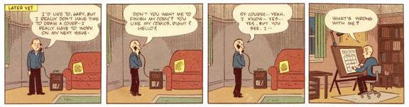
Figure 2 Detail of Daniel Clowes’ cover for The Comic Journal #233
[3] In an interview in Nude magazine, Clowes said, “I wanted to have a comic book critic that I could make fun of, and very early on that got to be not interesting at all-such an easy target. So I made (Naybors) say things I sort of agree with, and then that I didn’t exactly agree with, and he became something else.”
[4] Clowes lampooned Spiegelman as “Gummo Bubbleman” in his 1994 collection “Pussey.” The New York Times Magazine (7/11/04) erroneously claimed that Clowes was Spiegelman’s discovery. Both artists appeared together as cartoon characters in an episode of “The Simpsons.” When I asked him last term, Art had not yet read “Ice Haven.”
[5] The Iranian cartoonist Marjane Satrapi’s graphic novel “Persopolis” utilizes a linear version of the illuminated page architecture, flattened space, and impersonal figures described in Pamuk’s book. Like Clowes, Satrapi is now diverting into film, where their comics’ higher associations with illuminated literature and books disappear.
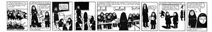
Figure 6: Marjane Satrapi's “Persopolis:” emotive templates, flat space and the visible hand of the artist.
[6] Currently, the reverse is true. Major companies offer some talent creator-owned contracts, but publish few comics intended for younger children, with the result that the audience for their products might not regenerate. Bookstores may be the last bastion of comics, as the form shrinks and disappears, like the art of Pamuk’s miniaturists.
[7] Regarding standards of criticism, I have been placed in a position resembling that of Charles Kinbote by the whims of tragic circumstance. I collaborated on a graphic novel, “Seven Miles a Second,” with the late writer, artist and AIDS activist David Wojnarowicz, and later, with multimedia artist Marguerite Van Cook. Even at the time we began the project David had assumed legendary status as an artist, but the book was not to be about the successful part of his life but rather about his youth as a homeless gay kid. From the beginning in 1986, I edited David’s autobiographical fragments, monologues he had transcribed, and dreams he had written down on awakening into a text that would work with my page designs and drawings in comics form. Without diminishing the importance of David’s writing, as it was his story and the way he articulated his worldview that was the spine of the book, he chose to work with me because I am versed in the language of comics.
He wanted it to comprise three parts: him as a nine year old rent boy on Times Square, as a homeless teenager, and as a young adult facing his mortality with AIDS. I structured David’s raw prose into continuity, and selected from a voluminous pile of typed manuscripts to find sequences that could make sense as a continuous narrative according to the general trajectory we discussed. I brutally edited long passages into a few caption blurbs, always preserving the most essential relevant line, and designed individual panels to work as within greater page compositions, as well across gutters to the adjacent page, utilizing widescreen two-page spreads when possible. The drawings function simultaneously with the text on reading, the eye is led where I want it to go, and as much as possible the text is not redundant with the drawings. The text and art complement each other.
David intended for me to have autonomy for the art, but suggested a few visual ideas which I incorporated into the pages. He approved my arrangement of his writing and was satisfied with the first two sections, but died of AIDS before I began the third and final section. In a sense, David was my John Shade. I felt the need to complete this work so invested by us both, to do honor to my friend’s intent as best I could. I was given access to David’s last journals by his former lover and executor of his estate, Tom Rauffenbart. I completed the book by editing passages from the journals with some of his other late writings and according to what I had spoken with David about the final section, in our last meetings before his death. I did this while personally unsettled with grief at my friend’s death, so the editing process was a sad effort, much less the visual aspects. I incorporated everything David and I had discussed at our last, too-brief talks, but I had to make a decision that went astray from his intent, in that he had expressed at our last meetings that he wanted to end with a beautiful day, and him just being happy to be alive, but there was nothing that would approximate that in his writings. The section ended with the author’s death. Manuscripts (dummies) circulated around the highest of publishing circuits, and an impressive pile of rejection letters took formed in my files. A few publishers were interested to do the in black and white from my drawn pages, but David and I had envisioned the book to be in color. Finally, an odd set of confluences led to the book going into production for Vertigo Vérité, a brief-lived imprint of Vertigo/DC Comics.
I had long thought I would do the color, but realized that what I would do would reference my comics influences; this needed something different. My wife Marguerite, who also had been David’s friend, brought her own multiple layers of painterly depth when she colored the finished drawings, and became the true third collaborator. She subverted the coloring-book mentality that pervades comics history by “going outside of the lines” and using color to link scenes and for emotional and psychological effect. In the next edition her name will be on the cover with mine and David’s. This might seem obvious given her spectacular contribution, but I was not able to force DC to put her name on the cover of the 1st edition. The American comics industry traditionally rates coloring as the lowest part of the production totem pole. This flies in the face of the fact that color is a great part of the initial impact of art, and a prime selling factor. Color only began to be credited in the 1970s. It is still a low-paid function, now usually done by computer technicians. Marguerite’s watercolor paintings were given to a digital separation company to translate her sublime hues to flat digital color. The computer artist seemed colorblind, rendering her oranges as pink and other misreadings, but Marguerite was able to correct the proofs and the colorist completed the book to her satisfaction (the next edition will utilize the original watercolors).
After ten years of production it was important to have the book of David’s experience published. It was amazing that DC went with it. Despite their inverted logic, they gave us impressive production values for color printing. They did not make alterations to the artistic content of the book. They did package it with their design department, asked Tom Rauffenbart to write an introduction, and hired art critic Carlo McCormick to write an essay about David, a prime example of textual obfuscation. Seven Miles a Second was released in 1996, to critical acclaim.
The only notice that bothered me was in The Village Voice, by Elizabeth Hess, a writer who had covered David’s battles with AIDS and the NEA for that paper. Hess praised the book as “destined to be come one of the major autobiographical works from the decade” and noted that the text was “brilliantly edited to comic-strip brevity,” yet for unknown reasons ascribed the editing to Rauffenbart. I was thrilled that the Voice thought the editing was brilliant, but not happy that what was perhaps the most difficult part of my job was being credited to Tom, who the writer knew personally, who had been peripherally involved in the project and who controlled my former collaborator’s estate. He had no hand in the creative work of the book beyond allowing me to use David’s journals. He is an unwitting participant in this critical snafu. I mentioned the error to Hess when I met her at an opening. She later wrote another piece which disparaged my artwork on the book. Insult to injury, and if she had actually fact-checked what she was writing and asked either of us about the editing I assume she would have been set straight on the matter. At the time I considered writing a letter to the Voice to correct the mistake, but let it go. That was my mistake.
In 2000 Publisher’s Weekly’s graphic novel imprint Reed Graphica contracted for a second edition of Seven Miles a Second. To “freshen” the book at their request, in a Kinbotean sense I took on again the task of realizing the intent of my dead compatriot. I restored some sequences that I had left on the cutting room floor so to speak, including a page that showed David painting, partly in response to an internet critic who wondered why the book did not show him as an artist. I had actually originally left it out because in this book I was the artist. The book became stronger. We replaced the intro and essay with a ten page comic story Marguerite and I did, her recollection of a conversation she had with David, that in design and execution is a semiotic manifesto of the comics form, and an intimate, albeit cartoony, picture of David from our collaborative viewpoint. Unfortunately, Reed Graphica folded after just four books, just before we were to go to press. The project is ready for print but again languishes for want of a publisher.
Figure 7: outside and inside, from Seven Miles a Second by Wojnarowicz/Romberger/Van Cook
For years, I had been aware that a review of Seven Miles a Second has been published in The New Art Examiner, a Chicago critical journal, but I had never seen a copy. Last month I found the e-mail address of the critic, now Associate Professor Richard Schindler of Alleghany College, and wrote him asking for a copy. He replied with jpegs of the generally positive review, but I was taken aback to read, “Uncompleted at the time of Wojnarowicz’s death in 1992, the work eventually saw publication as the result of Tom Rauffenbart’s careful editing and selecting of Romberger’s art and Wojnarowicz’s writings.” This relegates me to the role of an illustrator, like Pamuk’s miniaturists who simply render assigned drawings to relate to a text, which is organized by another hand, to be in book form. Tom has been turned again into Kinbote or the Enishte, the editing organizer. I wrote back to Prof. Schindler and asked him if he got that idea from the Village Voice, and he replied, “The ascribing of editorship to Rauffenbart came from some other source for my review, possibly the publisher's publicity; it certainly was my error in terms of including it in the review. I actually never read any other reviews of the comic book when it came out, so I can't blame the Voice for the mistaken assumption.” Now there are two sources that have repeated the same misinformation, and yet another, unknown. I never saw that in any of DC’s press releases. Could they have sent out material that I didn’t approve? Seven Miles a Second is in the curriculum of university classes on Gay Studies, and students often write essays using it. Hess’ and Schindler’s errors will be compounded exponentially by misled researchers. I now have to stipulate approval of all promotional materials, and a clearly visible editor’s credit on the next edition, risking looking more like Kinbote, but the nature of the work involved in comics is such that these issues of creative control are important.
| Comic Art Forum | Ground Zero | Arteries |